Redefining Healthcare Design with Neuroaesthetics
By Arunima Rajan
Discover how neuroaesthetics, an intriguing blend of neuroscience and aesthetics, revolutionises healthcare design. Learn how this young scientific field can enhance patient outcomes, foster healing, and shape the future of healthcare environments.
Sprouting its roots merely two decades ago, Neuroaesthetics is a fledgling entrant in the scholarly world, busily unwrapping the mysteries of our biological responses to all things aesthetic. From tantalising artwork to soothing music, it's an ever-curious infant tirelessly probing why we, as humans, find things beautiful.
Megan Koehler is the Architect and Head of Healthcare at Perkins & Will, San Francisco. She notes that neuroaesthetic principles in healthcare design have the power to support a shift towards health and well-being in care environments and to create restorative environments for both patients and practitioners.
Why is neuroaesthetics important for healthcare design?
“We have spoken for years about the benefits of biophilia in healthcare, ensuring that patients have access to nature either physically or visually, allowing them to connect to the world outside their patient room to provide inspiration and positive distraction. Neuroaesthetics takes that to an additional dimension, extending to additional sensory stimuli to reduce stress and focus on healing. It allows us to recognise neurodiversity as well, understanding that we all experience our environments differently, and to encourage us to create truly universal design, taking into account physical, sensory, cognitive and spatial perceptions of our environments,” she explains.
Case Study: Lucile Packard Children’s Hospital at Stanford
She adds that Lucile Packard Children’s Hospital at Stanford is an excellent example of neuroaesthetic elements incorporated throughout the healthcare facility. There is a robust art program that was designed and built
into the building, ensuring that there were moments of delight and discovery throughout the public spaces, creating a welcoming environment for patients and families who often have long stays. The outdoor spaces are generous and visually accessible from all patient rooms, and physically accessible by patients of all ability, creating beautiful spaces for patients to connect with nature and art, and to gain respite from patient care areas. Koehler has received feedback from families who have spent significant time in multiple facilities who note that here the environment allowed their family to focus on healing, and having shared moments together discovering the artwork throughout the facility.
Koehler also adds that neuroaesthetic principles should go hand in hand with sustainability goals. “One of the tenets of Living Design that we champion is beauty and poetics, knowing that beautiful spaces enhance the human experience and that in turn, people will care for those spaces and ensure that they are maintained and upheld for an extensive lifetime. There are some quantitative aspects to sustainable design that align, such as measuring daylight and views to regularly occupied spaces, and there are some rating systems like the Living Building Challenge that asks for qualitative aspects,” explains Koehler.
She adds that Lucile Packard Children’s Hospital at Stanford is an excellent example of neuroaesthetic elements incorporated throughout the healthcare facility. There is a robust art program that was designed and built into the building, ensuring that there were moments of delight and discovery throughout the public spaces, creating a welcoming environment for patients and families who often have long stays. The outdoor spaces are generous and visually accessible from all patient rooms, and physically accessible by patients of all ability, creating beautiful spaces for patients to connect with nature and art, and to gain respite from patient care areas. Koehler has received feedback from families who have spent significant time in multiple facilities who note that here the environment allowed their family to focus on healing, and having shared moments together discovering the artwork throughout the facility.
Tim Krawetz
Koehler also adds that neuroaesthetic principles should go hand in hand with sustainability goals. “One of the tenets of Living Design that we champion is beauty and poetics, knowing that beautiful spaces enhance the human experience and that in turn, people will care for those spaces and ensure that they are maintained and upheld for an extensive lifetime. There are some quantitative aspects to sustainable design that align, such as measuring daylight and views to regularly occupied spaces, and there are some rating systems like the Living Building Challenge that asks for qualitative aspects,” explains Koehler.
As healthcare practice area leader and senior principal in Syska Hennessy Group’s New York office, Tim Krawetz leads a team of over 50 professionals in the Eastern and Central U.S. and Shanghai, China.
He notes that neuro aesthetics have influenced the design of healthcare facilities in the 35 years he has been involved in healthcare design. “It was almost 15 years ago when I began to see artwork and accent colours introduced into healthcare environments. This was part of the outgrowth from evidence-based design, which really began to change the whole healthcare design approach. Prior to that, both the interior and exterior of facilities had more of an institutionalised feel to them. The focus was on maintaining a facility. As late as the 1970s, it was not uncommon to see hospitals being built of all brick. The change to creating a visually inviting structure turned the whole approach around,” he explains.
Krawetz adds that Syska Hennessy Group pivoted on architectural design. In addition to designing accent lighting to showcase artwork, they began to see more pronounced entrance lobby designs. “This all happened as LEED-focused design began to also take off. The lobby designs began to include 30-foot-high ceilings to create a more welcoming entrance and allow for lots of sunlight. The hospital lobbies began to mimic hotel lobbies essentially. We began to use radiant heating and cooling systems installed on the lobby floor, where it made sense from an engineering perspective. The radiant system is far more energy efficient as a result while also creating an environment without drafts or hot and cold spots,” he explains.
The Process
According to Krawetz, knowing who you are designing for is always important. "We designed a project recently for an outpatient facility built to treat autistic children. They have heightened sensitivity to their environment, and minimising any sudden changes to that environment was paramount to this facility. The noise control was critical to the design, as the sudden change in the sound of mechanical equipment starting or stopping could create a negative experience for the child. Our design focused on using sound attenuators and ducted elbows to reduce any breakout noise from mechanical equipment or from the movement of the air within the ductwork."
“Similarly, lighting control was important in creating a satisfying environment. We focused on dimming control, both from the control of light levels and for any sudden change in those levels. There was a need to ensure that there would be gradual lighting of spaces when first turning lights on, as well as no sudden change in lighting when moving between rooms due to sensitivity issues.
Natural lighting significantly impacts the overall patient, family member and staff experience. Including daylight sensors allows daylight to do its thing while facilities can also reduce operational costs,” he adds.
However, neuroaesthetics should not be viewed as in competition with functionality, safety, and sanitation. Rather, they all should complement each other.
Gina Chang
“Lighting controls are an example. Suppose lighting settings are reduced, as mentioned previously, to create an atmosphere for the patient. In that case, the controls can also be overridden to allow the cleaning staff to work. Those settings could then be readjusted back to a level more appropriate for patients. The approach should allow for design flexibility but also understand the needs of various user groups to bake that flexibility into the design without overwhelming the project budget,” he concludes.
Gina Chang is the Principal CO Architects, in Los Angeles. She is involved in integrating neuroaesthetic principles into architectural designs, striving for a balance between aesthetic appeal, patient comfort, and operational functionality.
“Numerous studies show that patients’ environments profoundly affect healing. Colour palettes are an enduring example of sensory inputs that stimulate neurological responses. More than a decade ago, CO Architects began integrating biophilic features into healthcare design. This included a green roof at Palomar Medical Center near San Diego, California (2012). Our “garden hospital” approach brought nature inside wherever possible—whether physically at elevator-lobby garden terraces or visually through planned views—and has been a priority ever since. This philosophy even extends to daylit operating rooms. Our most recent implementation of ORs with natural lighting is at Cedars-Sinai’s Advanced Health Sciences Surgery Pavilion in Los Angeles, California (2021),' says Chang.
Palomar Medical Centre
“Numerous studies show that patients’ environments profoundly affect healing. Colour palettes are an enduring example of sensory inputs that stimulate neurological responses. More than a decade ago, CO Architects began integrating biophilic features into healthcare design. This included a green roof at Palomar Medical Center near San Diego, California (2012). Our “garden hospital” approach brought nature inside wherever possible—whether physically at elevator-lobby garden terraces or visually through planned views—and has been a priority ever since. This philosophy even extends to daylit operating rooms. Our most recent implementation of ORs with natural lighting is at Cedars-Sinai’s Advanced Health Sciences Surgery Pavilion in Los Angeles, California (2021),' says Chang.
City of Hope National Medical Center in Los Angeles (2022).
Chang adds that one recent project with an excellent outcome is a kinetic parking garage façade at the City of Hope National Medical Center in Los Angeles (2022). “To improve patient views of a structural wall, we added 1,900 multicoloured aluminium “flapper” tags to a garage façade. Inspired by the City of Hope’s Wishing Trees, a tradition where patients and family members write inspiring messages on colourful ribbons and tie them around designated trees in the campus courtyard, the kinetic wall shimmers in the wind. The tags adopt the “prospect and refuge” theory: viewers see and perceptually “feel” colourful movement from a safe place—especially beneficial for immunocompromised patients who don’t adapt well to environmental changes. Cancer patients report that watching the tags produces mesmerising, soothing neural responses. The architecture team even received emails from patients saying how pleasantly distracting the wall is to watch during their cancer treatments. Functionally, the tags reduce solar gain and glare."
Chang points out that features for future projects might include similar approaches that also incorporate strategically planned acoustics, possibly influenced by “sound baths” and wave therapy. "For example, the 174 Hz frequency is said to reduce pain and stress,” she adds.
Future Designs
Neuroaesthetics suggests that certain environmental factors can impact patient recovery, mood, and overall experience in a healthcare setting. How do you leverage this understanding to improve patient experience in your future designs?
“The best example is our in-progress project for the new University of California, Irvine, Medical Center Irvine. One of the world’s first all-electric/off-grid hospitals, its 11.6-acre site is adjacent to the San Joaquin Marsh Reserve. This location influences many of our decisions. Designed nature paths through the preserve will improve the mental and physical health of patients, families, and staff. Landscape plantings are chosen for multi-sensory benefits: aesthetics and soothing scents. Floor-to-ceiling windows increase daylighting and expand views of the marsh, both priorities in the facility’s design. The colour palette uses calming hues influenced by the seaside location. Public-area art incorporates indigenous wildlife. Placement of the facility’s heat pumps is strategically planned to isolate patients from the noise,” she explains.
Challenges and Solutions
“Our process starts with meeting governmental health, safety, and energy requirements. The design priority used to be almost entirely patient-centric; our current challenge is to implement supportive working environments for staff. Sensitivity to making daylight available in staff areas and the inclusion of private Lavender Rooms for staff to decompress from crisis situations (with the help of calming views, soothing colours and materials, and aromatherapy) are two of the several ways we’re working with healthcare administrators and staff to improve employee retention through design. More design resources are allocated toward staff amenities and experiences now. Further, AR/VR tools and goggles allow us to virtually model designs with healthcare providers to test various layouts, collaborating to create ones that look and “feel” the best. We’re constantly looking for the best ways to appeal to as many senses as possible through a facility’s design". Chang concludes that the ultimate goal is to create the healthiest possible environment for patients, their families, and healthcare providers.
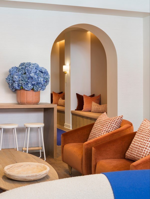
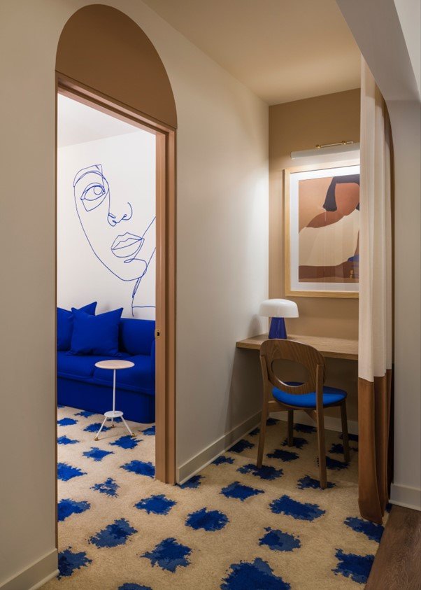
Real is an organisation that aims to build community and visibility around mental wellness. BHDM’s design for the flagship location in NYC is the physical manifestation of these goals. The BHDM Design team partnered with Real to rethink the user experience at all steps along the way.
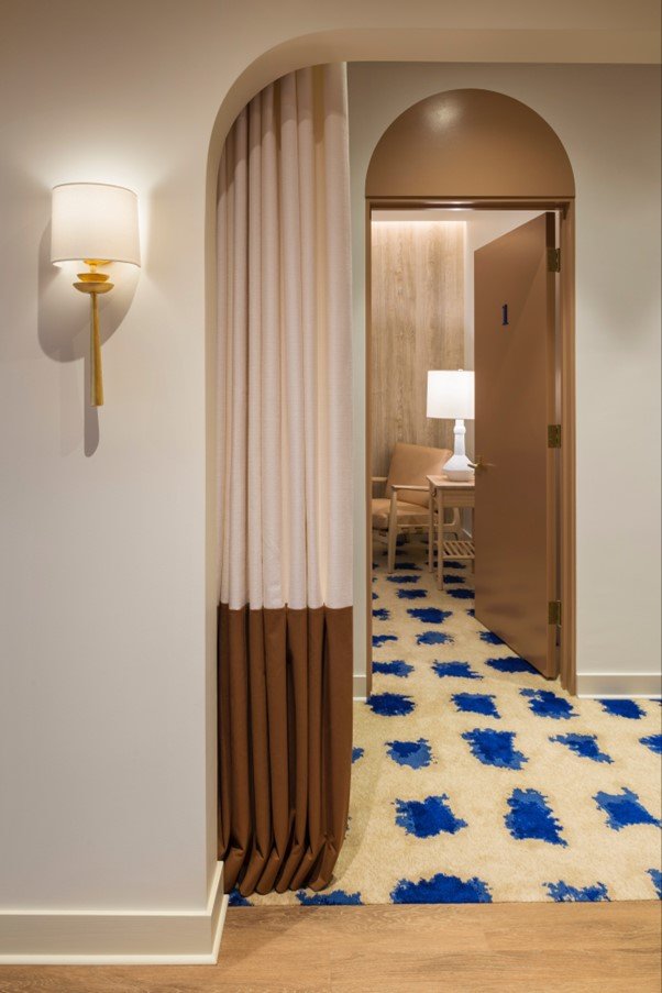
The corridor connecting pre-session with therapy suites at Real, acts as a transition from the everyday world to the therapy experience. It is lined with "meditation stations," with digital meditation exercises on iPads. Before entering individual therapy appointments, guests are encouraged to stop at the "front porch" of each suite - a counter and cosy chair, with custom artwork and soft lighting - to interact with thought-provoking analogue questionnaires to spark productive conversations in session.
Dan Mazzarini is the Principal and Creative Director at ARCHIVE by Dan Mazzarini.
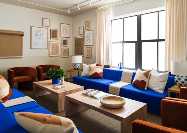
“The design of this space was driven by the intention to support patients at all stages of therapy - from preparation to participation and post-treatment care, moving beyond the typical 15-minute session. The design is deeply focused on the user experience, offering various comforting elements, like porches and nooks, along with communal spaces for larger gatherings. Taking inspiration from the practice's owner, we incorporated elements like the striking blue sofa - a feature that has become a distinctive business symbol. Much like the overall design of the sofa, this sofa redefines therapy as a process to be celebrated and empowering, not something to be coddled. Therefore, the design reflects and reinforces the practice's principles and mission," says Mazzarini.
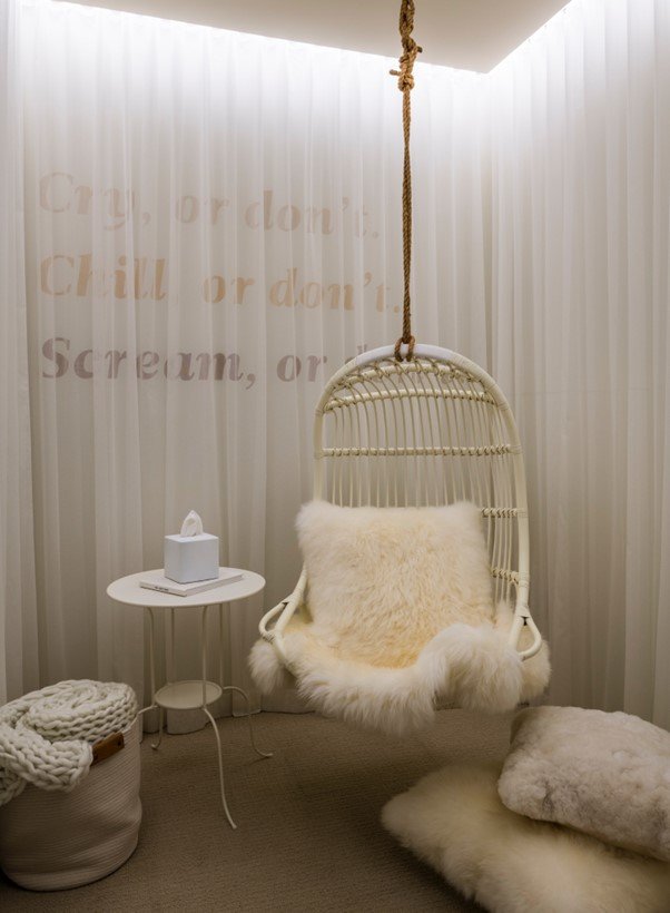
Individual therapy suites are intended to be empowering and nurturing: soft lighting washes wood walls, and custom graphics were installed over signature blue sofas, rounded out by residential floor and table lamps.
The “front porch” offered a space to reflect before therapy treatment. Analogue cue cards help patients prepare for the session by uncovering an intention or direction. This little “warm-up” helps cut down some of the upfront work in a traditional session spent getting to the core,” explains Mazzarini. He adds that design is always subjective. In line with REAL’s mission, our goal was an empowering atmosphere. All of the touchpoints are residential-oriented to provide a familiar and nurturing sensibility. Everything from the drapery to the tissue boxes, and even the soft bathroom lighting to make you look your best, were carefully considered.
He also adds that traditionally, therapy is a very individual, almost secretive journey. The intention of this practice, and the design of this space, is to celebrate therapy and recognise the practice as a pillar of wellness. The idea is largely reflected in the open living room area.
“We made passive but intentional design decisions to remove the stigma and shift the therapy narrative from shame to empowerment,” he concludes.


